OHME! FOODS - WEBSITE RE-DESIGN
Crafting a Credible Experience
ROLE
Designer & Researcher
TIMELINE
3 days (April 2025)
TEAM
4 Designers
SKILLS
Product Design
User Research
OVERVIEW
British Columbia’s largest design-a-thon

Over 3 days, we were asked to research and propose a website redesign for a randomly assigned client. Out of 168 participants across 12+ clients, our solution finished second overall. Fuelled by snacks and surrounded by paintings in a chaotic art room at the top of Emily Carr University, we had a blast doing it.
SNAPSHOT
Design focused on trust and effortless purchasing
PROBLEM SPACE
Scrumptious snacks lost in the digital aisle

OHME! is a health-focused brand making nutritious, freeze-dried fruit snacks and breakfast bowls that are fun, tasty, and accessible. Their audience consists health-conscious, busy professionals who want quality, convenient snacks.

Despite a genuinely great product, less than 30% of their sales came from online orders. OHME! needed a redesign that would boost sales, simplify purchasing, and build a more human, community-driven website.
OBSERVATIONS
Taking inventory

Our first step after meeting with the client was a thorough site audit. The existing website had no shortage of usability and visual design issues, which gave us a clear picture of how information was being presented and where things needed to change.
COMPETITIVE ANALYSIS
The healthy-snack landscape

Brands in this space tend to fall into one of two camps. Some lean into playfulness and personality but sacrifice credibility, while others feel polished and trustworthy but come across as cold and corporate. OHME! had an opportunity to sit in the middle: a brand that felt both premium and vibrant, trustworthy without being bland.
USER RESEARCH
Peeling back the layers & arriving to our framing
All this analysis still lacked a key source of information, actual users! We couldn’t move forward without hearing from people who actually use these products. We conducted 3 user-interviews with health-conscious, snack enjoyers. Using the “Thinking Aloud” method, users were tasked with purchasing an item from OHME!. From there, 3 key insights drove our design:
Lack of trust
In general, participants didn’t see OHME! as credible. The website lacked integrity. They said that they “wanted to buy freeze-dried fruit now, but not from this company, because they couldn’t trust them.”
Information overload
Users were overwhelmed by the choices and visual clutter, discouraging purchases.
Problematic navigation
Participants could not find relevant product & company information.
DESIGN PROCESS
Coherence, Consolidation, & Vibrance
How might we create a seamless, fun, and energetic purchasing experience while increasing brand integrity and credibility?
Structural clarity in architecture
We began our design process by focusing on the client’s need to simplify the purchase flow. This meant going over the site architecture and refining user pathways to reduce friction and make the buying experience intuitive.

Before: Confusing navigation, hidden social proof, cluttered pathways, and a fragmented purchasing journey leading to info overload.
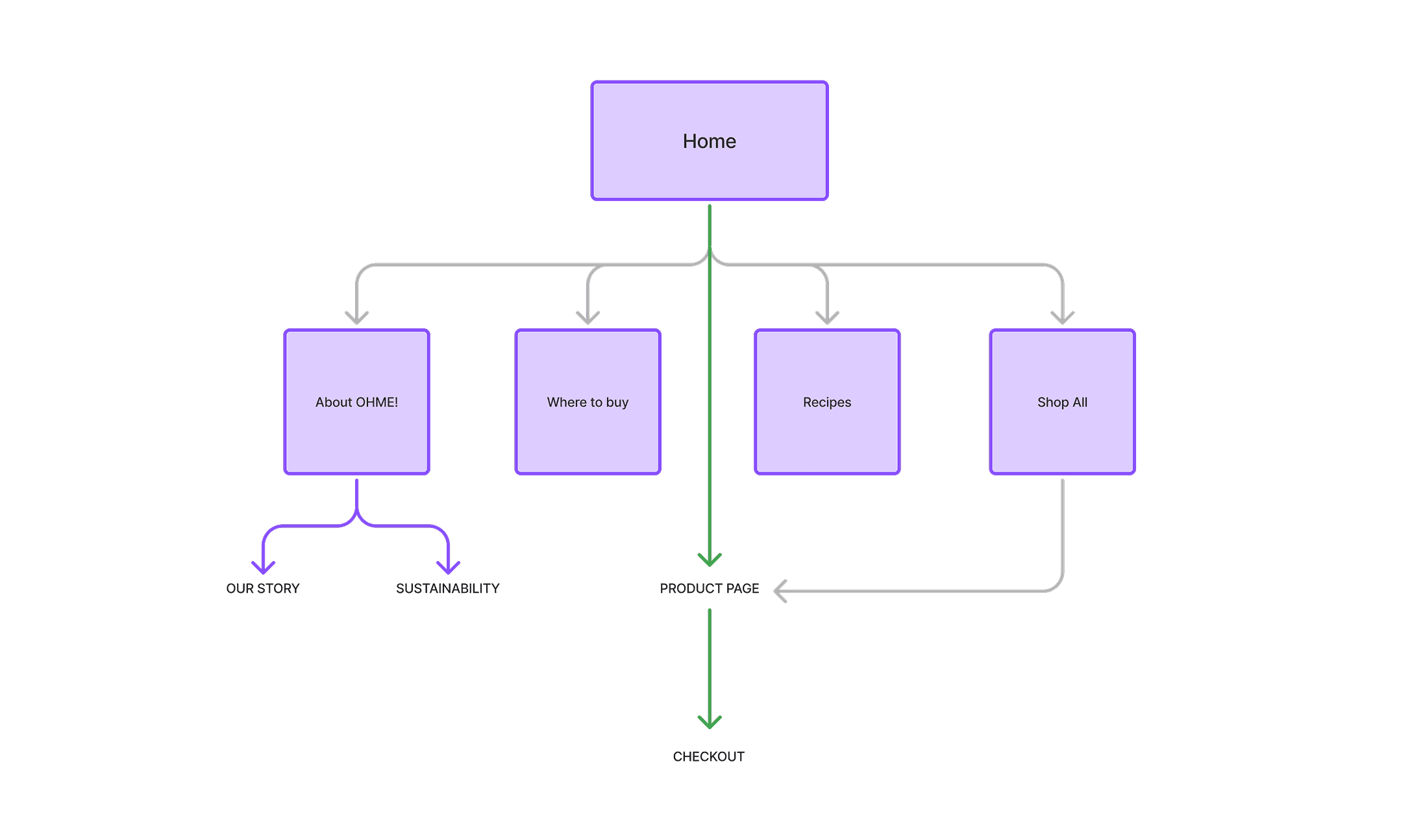
After: Easy access to product pages from the start. Credibility built through social proof under a consolidated “About” page.
Too much too soon?
Our early wireframes showcased every product on the homepage, but it became clear that this approach was overwhelming and hard to navigate. Was there a better way to simplify the process and reduce overload?

Simplifying the shelf
Following deep discussion, our team decided to merge OHME!'s 30 different listings into 4 categories of product lines. This decreases fatigue and prevents users from being overwhelmed, facilitating smarter choices.

Visual Direction
We worked to strike a balance between OHME!’s vibrant, maximalist identity and a cleaner layout that emphasized white space and clarity to evoke a sense of trust and premium quality. Narrowing the colour palette to a few bold shapes and tones, the result felt like intentional, exclusive, yet still energetic.

FINAL DESIGNS
A site worth buying from
Dynamic hero section
Guided purchasing
Digestible experiences
Interactive store locator
REFLECTIONS
A site worth buying from
Welcoming the process
Working from the ground-up accounts for design debt and makes the rest of the process easier. So many times, I get the urge to just jump right into designing after conducting research (especially after working for a fast-paced company like Samsung). This was especially prevalent because we didn't start designing until the end of day 2, so I was super worried about our chances of completion. However, this experience taught me that despite time constraints, having patience and trusting the process of collaborating and iterating makes for better and more efficient design.
Breaking the “I Got This” mentality
I used to hesitate to ask for help, worrying about "bothering" others if I felt capable of handling a task myself. During this sprint, exhaustion pushed me out of that mindset—I reached out to mentors and my incredibly talented teammates, and the results spoke for themselves. By collaborating more openly, I was able to tackle challenges more effectively. Moving forward, I want to be unapologetically upfront about when I need support, knowing that great work comes from great collaboration.
What could we have done differently?
Our internal collaboration was top-notch, but I think one area we could have improved on was taking our time to really connect with users post-redesign. Although our user interviews provided insight on what needed change, our solution wasn't properly put to the test until we reached the judges panel.